
Why is Responsive website Design So Important?
A website is often the first point of contact between a business and its audience. With the proliferation of diverse devices and screen sizes, the importance of responsive website design has become paramount. Let's delve into why having a responsive website is not just a trend but a crucial element for online success.
Defining Responsive Website Design: The Symphony of Flexibility
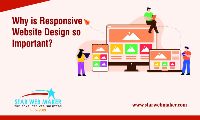
Responsive Website Design is more than a technical term; it's a dynamic philosophy shaping the virtual landscapes we traverse. At its core, RWD is an innovative approach that ensures websites elegantly adjust to the diverse screens of users' devices. Imagine a ballet of code and design working in unison, choreographing a seamless dance of content and layout that captivates regardless of whether it's a desktop, tablet, or smartphone.
Why is Responsive website Design So Important?
1. Adaptability Across Devices
The era of desktop-only web browsing is long gone. Today, users access websites through an array of devices such as smartphones, tablets, laptops, and desktops. A responsive website ensures seamless and optimized viewing experiences, regardless of the device being used. This adaptability is essential for capturing and retaining the attention of a diverse audience.
2. Enhanced User Experience
User experience is a critical factor in determining the success of a website. A responsive design provides a consistent and user-friendly experience, reducing bounce rates and keeping visitors engaged. When users can effortlessly navigate and access information on your site, it fosters a positive perception of your brand.
3. Improved SEO Performance
Search engines favor responsive websites. Google, for example, considers mobile-friendliness as a ranking factor. A responsive design contributes to better search engine optimization (SEO), boosting your website's visibility and making it easier for potential customers to find you in search results.
4. Cost-Effective Development
Maintaining separate websites for different devices can be resource-intensive. Responsive design streamlines development efforts by creating a single, adaptable website. This not only reduces development costs but also simplifies ongoing maintenance, ensuring consistent content across all platforms.
5. Faster Loading Times
Responsive websites are designed to load quickly on all devices. Mobile users, in particular, expect swift access to information. Slow-loading websites can lead to frustration and abandonment. By optimizing for various screen sizes, responsive design contributes to faster loading times, enhancing overall user satisfaction.
6. Future-Proofing Your Website
Technology is ever-evolving, with new devices and screen sizes regularly entering the market. A responsive website is inherently scalable, adapting to future innovations without requiring a complete redesign. This future-proofing aspect ensures that your website remains relevant and effective in the long run.
Star Web Maker emerges as a guiding light in this digital journey, seamlessly blending innovation and functionality through Responsive Website Design. Let's explore why entrusting your digital aspirations to Star Web Maker is not just a choice; it's a pathway to unparalleled online success.
Why Choosing Star Web Maker for Your Online Presence
The digital landscape is in a perpetual state of evolution, and Star Web Maker doesn't just design for today; it designs for tomorrow. Choosing Responsive Website Design with Star Web Maker means future-proofing your digital vision. The adaptive nature of their designs ensures that your website remains relevant and cutting-edge as technology continues to advance.
In the realm of online visibility, Star Web Maker integrates Responsive Website Design seamlessly with SEO strategies. Recognizing the importance of mobile-friendliness in search engine algorithms, their approach ensures your website not only looks great but also ranks high in search results. It's not just about creating a website; it's about crafting a digital presence that stands out in the digital crowd.
Choosing Star Web Maker means entering into a collaboration that goes beyond client and service provider. It's a partnership fueled by innovation and creativity. The team at Star Web Maker collaborates with clients to understand their unique vision, infusing creativity into every aspect of the Responsive Website Design process. Your website becomes a testament to collaborative innovation, reflecting both your brand essence and Star Web Maker's dedication to excellence.
Conclusion
Responsive website design is not merely a trend but a fundamental necessity. Businesses that invest in creating a seamless, adaptable online presence are better positioned to connect with their audience, enhance their brand image, and stay ahead in an ever-evolving digital world. Embrace responsiveness, and let your website be a testament to your commitment to providing an optimal user experience.
In the vast sea of web development choices, Star Web Maker stands as a lighthouse, guiding businesses toward a future where their digital presence not only survives but thrives. By choosing Star Web Maker and embracing Responsive Website Design in Noida, you embark on a journey of innovation, user-centric experiences, and digital success. It's not just about designing websites; it's about creating digital landscapes that resonate with the aspirations of both brands and their audiences. Choose Star Web Maker and let your digital presence shine brighter than ever before.