


Smartphones and handheld gadgets have revolutionized the way you browse the web

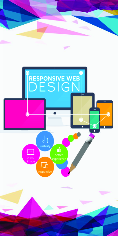
In today's digital age, where users access the web through an array of devices, from desktops and laptops to smartphones and tablets, providing a seamless user experience is paramount. This is where responsive web design comes into play. Responsive web design is a revolutionary approach to building websites that adapt and respond gracefully to various screen sizes and devices.
Responsive web design is a design philosophy and development technique that focuses on creating websites that can automatically adjust and optimize their layout, content, and images to suit the screen size of the device being used. Instead of building separate versions of a website for different devices, responsive design ensures that a single website serves all users effectively, providing an optimal experience whether they are browsing on a large desktop monitor or a small smartphone screen.
1. Fluid Grids: At the core of responsive web design are fluid grids. Instead of using fixed pixel-based measurements for elements, developers use relative units like percentages to create flexible layouts. This allows the content to expand or contract proportionally based on the user's screen size.
2. Flexible Images: Images are a crucial part of web content, and in responsive design, they must also be flexible. Using CSS properties like max-width, images scale proportionally to fit within their container, ensuring they don't overflow or become distorted on smaller screens.
3. Media Queries: Media queries are CSS rules that allow developers to apply specific styles based on the user's device characteristics. However, by defining breakpoints, developers can change the website's layout, typography, and other design elements to accommodate different screen sizes and orientations.
4. Mobile-First Approach: Adopting a mobile-first approach means designing the website with the smallest screen in mind first. This ensures that essential content and features are prioritized for mobile users, with the design then progressively enhanced for larger screens.
1. Improved User Experience: Responsive websites provide a consistent and intuitive user experience, regardless of the device being used. Users can easily navigate, read, and interact with the content, leading to higher engagement and lower bounce rates.
2. Cost-Effectiveness: Maintaining a single responsive website is more cost effective than managing multiple versions for different devices. This streamlines development, design, and content management processes.
3. Search Engine Friendliness: Search engines prefer responsive websites because they offer a unified user experience across devices. As a result, responsive sites often rank higher in search engine results, increasing visibility and organic traffic.
4. Easy Maintenance: With a unified codebase, updates, and changes can be made more efficiently, saving time and effort in website maintenance.
5. Future-Proofing: As new devices with varying screen sizes emerge, a responsive website will adapt seamlessly, ensuring it remains relevant and accessible to users.
In an increasingly mobile-oriented world, responsive web design is no longer an option but a necessity for any website seeking to thrive in the digital landscape. By prioritizing user experience, embracing fluid grids, and employing media queries, responsive design ensures that websites deliver outstanding performance and adaptability across devices. Businesses that adopt this user-centric approach not only provide a delightful experience to their users but also enhance their online presence, engagement, and ultimately, their success. Embrace responsive web design today, and embark on a journey toward building a future-proof, user-friendly, and innovative web experience for your audience.
Star Web Maker, is a visionary web development company in Noida, India, leveraging the power of responsive web design to create exceptional online experiences.
One of the key reasons to choose Star Web Maker for responsive web design in Noida is their expert team of skilled web designers and developers. Furthermore, with extensive experience under their belt, they possess the acumen to understand the unique requirements of diverse businesses. Their ability to create customized solutions tailored to individual goals sets them apart in the industry.
A significant testament to their credibility lies in their proven track record. Over the years, Star Web Maker has successfully completed numerous projects, earning a reputation for excellence and professionalism. Their portfolio showcases a diverse range of responsive websites that highlight their capacity to consistently deliver high-quality results.
Recognizing the significance of a mobile-friendly approach, Star Web Maker ensures that all their responsive websites are optimized for various devices. In a world dominated by mobile usage, this ensures a seamless user experience regardless of screen size. Such attention to detail reflects their commitment to user satisfaction and engagement.
To stay at the forefront of web design, Star Web Maker employs cutting-edge technology and stays abreast of the latest trends. Their creative and innovative approach results in websites that are not only visually captivating but also functionally robust and user-friendly.
At Star Web Maker, the journey begins with understanding the unique requirements of each client. However, they collaborate closely with businesses in Noida to comprehend their brand identity, target audience, and business goals. This insight forms the foundation for creating a custom responsive design that resonates with the brand and delivers a personalized user experience.
To ensure a seamless transition across devices, Star Web Maker employs fluid and flexible grids in their responsive web design. The use of relative units, such as percentages, allows content to resize proportionally, providing a consistent visual experience regardless of screen size.
High-resolution images are essential for captivating web experiences, but they can also slow down a website's loading time. Star Web Maker optimizes images for various devices to strike a balance between visual appeal and performance. This ensures that images load quickly without compromising on quality.
Leveraging the power of media queries, Star Web Maker sets breakpoints in their responsive designs. These breakpoints determine when specific design adjustments are applied based on screen width and orientation. This meticulous attention to detail ensures that users receive an optimal experience at every stage of their browsing journey.
Embracing the mobile-first approach, Star Web Maker prioritizes the needs of mobile users during the design process. Furthermore, by focusing on delivering essential content and functionality to smaller screens first, they ensure a user-friendly experience for the majority of users who access websites on their mobile devices.
With Star Web Maker's responsive web design, users in Noida enjoy a seamless and intuitive browsing experience on any device they choose, leading to increased engagement as well as higher conversion rates.
Google and other search engines prioritize responsive websites in their search rankings. Moreover, Star Web Maker's responsive designs ensure that their client's websites rank higher, attracting more organic traffic and visibility.
The adaptability of Star Web Maker's responsive designs guarantees compatibility with all devices and screen sizes, eliminating the need for multiple versions of the website and reducing maintenance efforts.
By prioritizing user needs and delivering a user-friendly experience, Star Web Maker's responsive web design fosters customer satisfaction and encourages repeat visits, fostering long-term relationships with clients' audiences.
In the thriving business landscape of Noida, a captivating online presence is the key to success. Star Web Maker, with its expertise in responsive web design, has been a trailblazer in providing businesses with dynamic, user-centric websites that leave a lasting impression on users. However, by employing fluid grids, optimized images, and a mobile-first mindset, Star Web Maker ensures that its clients' websites are adaptable, visually appealing, and performance-driven on any device.
So, if you're a business in Noida looking to elevate your web presence and captivate your audience, look no further than Star Web Maker. Embrace responsive web design, and let the experts guide you toward a future-proof and user-friendly web experience that sets you apart from the competition.
We can assist you in Website Services, E-commerce solutions, CMS Websites, Mobile App development, Custom Application development, Internet Marketing, Search Engine Optimization, GUI & UX Designing.


