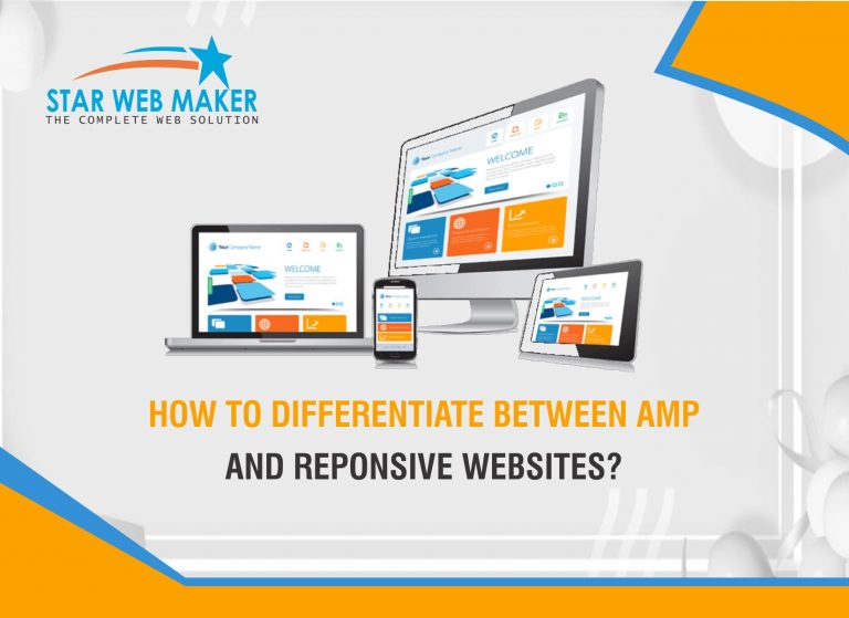
Most people across the world mostly prefer to access the internet on their mobile gadgets. Therefore the developers are responsible to create such websites which can open easily on smartphones and smart gadgets. Sometimes slow page loading during accessing any websites on smartphones is major obstacle for people. Once a website is unable to open then people may to exit from it.
Accelerated Mobile Pages (AMP) is an initiative which has started by Google. It created to publisher mobile-optimized content which instantly loads on all devices by using optimizing tools. The Goal of Google is to establishing projects to get web pages with different content such as graphics, video, animations to work together with ads and load as fast as possible.
What is Accelerated Mobile Pages (AMP)?
In manner to find the solution of slow page loading, Goggle create and presents AMP which helps in providing quick loading pages and content for smartphones.
AMP is very useful for mobile phone when developers are looking forward to providing content to their users with fastest speed.
AMP also helps in securing revenue comes from ads as far as content provider concerned.
The Important of AMP can identified by the highly important content are offering to users with lightning fast speed.
At present most of the companies can easily implement Accelerated Mobile Pages technology and tools that comes to developing AMP pages for their websites.
What is Responsive Web Design?
Responsive web design is the method that suggest to design and development should respond to the need of users and their device’s behaviors and environment, based on the screen size, platform and orientation.
RWD work through cascading style sheets, using different style properties.
All the style properties are depend on the screen size, resolution, color capability and other characteristics of user’s devices.
Difference between AMP and Responsive Web Design
AS we know that both responsive web design and AMP are effective for mobile phones, the facts about them are used for fulfilling different purpose and goals
Responsive web design is concerned with highly crucial way of planning and designing of websites that can be access effectively by users on their devices like smartphones and computers etc. RWD is a method of developing websites that can access properly by user’s any devices. But AMP in a amend web framework which is delivered a best quality content to user’s devices with a fastest speed.
With AMP, no need to replace the websites, you can add Accelerated Mobile pages to websites without having to redesign the site. Apart from that implementing Responsive web designs on websites as you need to redesign the entire website.
Though it’s entirely correct that responsive web design helps in building quality websites for multiple devices, but AMP remain important because it helps in enhancing the user experience by delivering the content to them with a rapid speed.


