
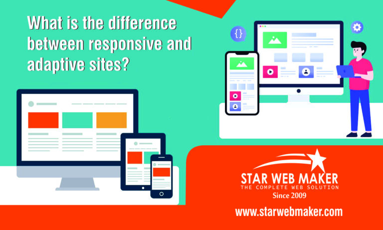
What is the difference between responsive and adaptive sites?
In the ever-evolving realm of web development, the terms "responsive" and "adaptive" are often used interchangeably, yet they encompass distinct approaches to creating a seamless user experience across various devices. Let's delve into the nuances of these two methodologies to understand how they shape the digital landscape.
Responsive Web Design: Fluidity Across Devices
Responsive web design is a design approach that focuses on creating a flexible and fluid layout that adapts to different screen sizes. It utilizes a combination of flexible grids, media queries, and CSS styling to ensure that a website seamlessly adjusts its layout and content based on the device it is viewed on. This adaptive nature allows for a uniform user experience, whether accessed on a desktop, tablet, or smartphone.
Key Features of Responsive Design:
- Fluid Grids for Flexible Layouts: At the heart of responsive design lies the use of fluid grids. These grids employ relative units like percentages instead of fixed units, allowing the layout to adapt and scale seamlessly across various screen sizes. This fluidity ensures a harmonious experience whether the user is accessing the website on a desktop, tablet, or smartphone.
- Media Queries for Responsive Styling: Responsive design harnesses the power of media queries, which are conditional statements in CSS that trigger specific styling rules based on device characteristics such as screen width and resolution. This enables the website to adjust its presentation, ensuring optimal readability and visual appeal on different devices.
- Mobile-First Approach: Responsive design often adopts a mobile-first approach, prioritizing the optimization of the website for smaller screens. Starting with a mobile-friendly foundation, the design progressively enhances for larger screens, ensuring a seamless transition and optimal user experience as the screen size increases.
- One Codebase for All Devices: A key feature of responsive design is maintaining a single codebase for all devices. However, this streamlined approach simplifies development, updates, and maintenance. Changes made to the code automatically reflect across all devices, offering efficiency and consistency in the web development process.
- Consistent User Experience: The primary goal of responsive design is to provide a consistent user experience irrespective of the device. Whether a user accesses the website on a desktop, tablet, or smartphone, the layout and content dynamically adjust to offer an optimal and visually appealing experience tailored to the specific device characteristics.
Adaptive Web Design: Tailored Experiences for Specific Devices
Adaptive web design, on the other hand, involves creating multiple layouts designed for specific devices or screen sizes. Rather than relying on a single flexible layout, adaptive design delivers a predetermined layout based on the device characteristics detected. Each layout is optimized to offer an optimal user experience on a specific device category.
Key Features of Adaptive Design:
- Device-Specific Customization: Adaptive design thrives on creating distinct layouts for specific devices. This customization ensures that users encounter a design optimized for their device's screen size and capabilities, fostering an intuitive and engaging experience.
- Server-Side Detection: At the core of adaptive design is server-side detection, a mechanism that identifies the characteristics of the user's device. This enables the server to deliver the most appropriate layout, streamlining performance by minimizing unnecessary asset downloads and ensuring efficient use of resources.
- Performance Optimization: A key focus of adaptive design is optimizing performance for varying device capabilities. By tailoring layouts to specific devices, developers can fine-tune performance parameters. This results in faster load times and a seamless user experience, especially crucial for devices with diverse processing power and network speeds.
- Progressive Enhancement: Adaptive design often employs a strategy of progressive enhancement. This approach begins with a baseline design that functions universally across devices and progressively enhances the experience for devices with advanced capabilities. It ensures a consistent and functional user experience for all users while leveraging the unique features of high-end devices.
- Flexibility and Scalability: Adaptive design thrives on flexibility and scalability. Its ability to accommodate a wide array of devices ensures that websites remain functional and visually appealing. As technology evolves, adaptive layouts can be easily expanded to include tailored designs for new devices, ensuring longevity and relevance.
Choosing the Right Approach
Responsive Design is ideal when:
- Consistency across a variety of devices is a top priority.
- A cost-effective and time-efficient solution is required.
- The content structure remains relatively consistent across different screen sizes.
Adaptive Design is preferable when:
- Tailored user experiences for specific devices are essential.
- There is a need to optimize performance for different device capabilities.
- The design and functionality vary significantly across devices.
Star Web Maker, a distinguished player in the digital domain, sheds light on the crucial differences between responsive and adaptive sites, guiding businesses towards informed decisions.
Choosing the Right Path: A Consultative Approach
Responsive or Adaptive?
Star Web Maker understands that the choice depends on project goals and user expectations. They offer a consultative approach, ensuring that whether you're aiming for consistent flexibility or device-specific precision, your digital journey aligns with your vision.
In the digital landscape's complex terrain, Star Web Maker emerges as a guiding star. Moreover, with a commitment to innovation, user-centricity, and a harmonious blend of form and function, they redefine the web development experience. Let Star Web Maker be your compass, steering you toward digital success with every click, scroll, and interaction.
Conclusion: Striking the Balance
While responsive and adaptive designs have their distinct advantages, the choice between them often depends on the specific goals and requirements of a project. Striking the right balance between a consistent user experience and device-specific optimization is key to navigating the diverse landscape of the digital world. Ultimately, the success of a website lies in its ability to engage users seamlessly, regardless of the devices they choose to explore it on.
Star Web Maker emerges as a reliable partner, steering businesses towards the right path in the responsive versus adaptive conundrum. With a commitment to crafting websites that transcend expectations, Star Web Maker ensures that each digital journey is a testament to innovation, user-centricity, and a harmonious blend of form and function. As a Responsive Website Development Company In Noida, they combine innovation, expertise, and a client-centric approach to craft websites that not only meet but exceed expectations. Embrace the future of web development with Star Web Maker – where responsiveness meets excellence.