
Top 10 Formula For Responsive Website Design
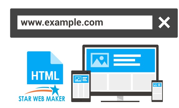
Responsive web design is essential for attracting more target customers from different parts of the world; first of all, the responsive website can provide the ultimate experience. These kinds of the website perfectly suit for many devices as well as screen sizes now it becomes hottest trends. Now developers consider this kind of web design due to the growth of smartphones as well as mobile devices.
In order to create a successful responsive website design, you need to know about different tools that can make the complete task easier. However, rapid involvement in technology makes everything simple and easy. To design a website you must consider to utilize the advanced formula to figure out how to best display elements as well as other options, website must be suitable for different devices
To get the innovative responsive web design you must approach Star Web Maker Services Pvt. Ltd. It is a professional web design company in Noida, here the expert’s works hard to provide the best of services with advanced technology. There are a lot of tools available for responsive web design these are utilized by experts to make everything simple and easy. Here the list of top 10 best tools for designing a responsive website.
- Switching To Flexbox
Flexbox is the smart individual modules; this can help control the layout of pieces of content. The layouts easily delivered easily by using Flexbox. Apart from that, it can play an important role when building sites responsively. Developers utilize the capabilities of flex-box for designing a responsive website.
- Plan Small And Create Big
You must create proper planning to design a website; you must stay focus on driving factors in a responsive web design that allows you to create better experiences for users on mobile devices. The features cannot be overstated, as well as the problem also arises while designing a website, first of all, the designers need to design perfect site with smart features and it must be cover the needs of the mobile user and fits for the different solution of the mobile screen. Overall, the responsive web design offers a great range of benefits because it suits various screen sizes even suits large displays.
- Viewport Resizer:
Viewport Resizer is the innovative and highly advanced design testing tool this also works as a bookmarklet. Most developers prefer to use this advanced browser-based tool that supports testing a responsive site within a seconds. To check the website you need to Click or Bookmark button. You need to choose the set of screen sizes that includes small-screen tablet, regular tablet, widescreen tablet, etc. custom web design is simple with the innovative technology, experts make use of various innovative methodologies for designing perfect website to cover different needs of customers.
- Simple And Easy Navigation
Navigation is considered a challenging aspect when it comes to design a responsive website. Developers experience a lot of complications when dealing with large and deep menus. Before going to design developers need to know what works perfectly. It is essential for getting consistent navigation experience on different resolutions. On the whole, navigation is accessed differs based on the resolution of the screen. Normally, the mobile responsive web design can be done by experts by utilizing the most advanced tools as well as techniques.
- Mobitest
Mobitest is one of the most important tools for designing a responsive website with innovative features. It is especially available for helping you test the mobile performance, to use this effective choice you need to enter into the website’s URL or web address. This will offer a complete set of mobile performance statistics; this will gives a quick overview of the website performance.
Even the results will be displayed based on the following parameters
- Average web page size
- Site’s average load time
- Waterfall chart
- Screenfly
Screenfly is the advanced tool for testing your responsive site without any difficulties. You can easily choose from a range of devices such as T, phones, tablets, desktop, etc. However you can also choose the custom screen size, this can help generate a URL to share the design as well as you have possibilities to rotate the screen for testing to reach better performance and fashion.
- Image Quality And Speed
When it comes to design a website you need to consider the speed of the website as well as image quality. The designer needs to add the best images on the website to attract more customers. As the designer, you need to pick the rich visuals and techniques for enhancing overall performance.
- Responsive Design Bookmarklet
Responsive Design Bookmarklet is important for testing any responsive website properly to function well, however it is considered as the handy testing tool that brings innovative features as well as makes everything look simple yet attractive. It can be perfect fits for tablets as well as smartphones flawlessly. Experts utilize these wonderful tools for adding excellence to the website. Responsive Design Bookmarklet is really useful for creating a perfect website to cover the needs of mobile users.
- Use Appropriate Icons
Developers consider using icons appropriately to enhance the complete performance of the website. Well, the designed website is important to attract customers from different parts of the world, a responsive website should be smart and perfect because it needs to fit for different screen sizes with various resolutions.
- Font Sizes
Choosing the right font is one of the important aspects while designing responsive website typography is important for making everything simple in the web design. When it comes to design a website you need to pay close attention to various things. Based on the choice you have possibilities to pick the right method for designing a innovative website.
Conclusion:
These are some of the important formulas that can help design a responsive website. If you are going to start a new responsive work then you must step back as well as consider the basics right. You can easily create an attractive responsive website by taking the above steps.


